Animating your icons can keep the user engaged on your page and add to the value of the icon, allowing for more creativity to be displayed in a way that’s simple and fun. Adding multi-step CSS animations to SVG’s is easier than you think!
Let’s take a look at the example below. Seems pretty familiar right? While waiting for that next text to come in, you’re watching an animation.
See the Pen Loading Symbol by Avery Williams (@averyhw) on CodePen.
This is a simple CSS animation to complete because there are only three parts to focus on. The more pieces there in your SVG, the more complex the animations will become and the more moving pieces there will be to consider. You may even have to involve some *gasp* math.
Creating these
Getting started
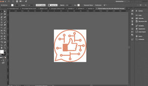
For today’s example, I’ll be using our social media icon from the homepage. It best displays fluid multi-step CSS animations appearing to be in one animation together. Sure, you can copy the code below, but what fun would that be?
An SVG or scalable vector graphic allow pieces of an icon to be targeted through css for animation. The first step of created your new animated icon is designing it using Illustrator or another graphic design program than can export vector art as an SVG.
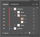
It is very important to make sure your layers are properly sectioned off and labeled with an intuitive name. Trust me, you don’t want to name everything thing1, thing2, thing3, because these names will become the ID tag of the piece in the SVG. Animating parts in an organized way will make it easier for you in the end. The more layers and groups you create, the easier it will be to animate through CSS.
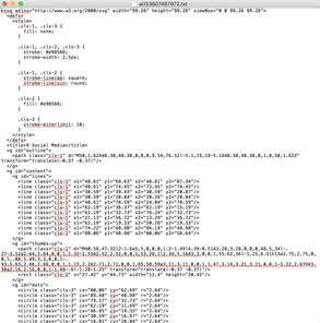
The next step is to export the artwork as an SVG and copy the code that is outputted. This can usually be done my clicking the “Show Code” option just before saving the SVG. The code it will spit out may look like the stuff of nightmares, but it’s actually all the little pieces of your icon broken down into coordinates and colors. Shapes are defined as familiar objects, such as lines and rectangles, and layers and grouped objects are labeled with <g> tags.
Take this code and place it in your favorite code editor and organize it to your liking. Try to make sure all the groups, labeled with <g> tags are separated and together. This is more about me wanting organization, so you don’t have to follow it if you don’t want to — I’ll never know.
Separate out the inline CSS and place it into it’s own style sheet or SASS file. Now, we can start the magic!
Calling the animations
First, you need to call the animation and set its parameters. Target the element and define the animation. See below for an example.
#element {
	animation: [animation name] [animation timing] [animation style] [animation iterations count];
}
So…
#element {
	animation: animate 3s ease infinite;
}
W3Schools has some great explanations of all the options you can place in the animation’s properties.
Creating the animations
Now, we make the CSS animation. This is all done through keyframes, so a different step should be happening at different percentages of the animation. Since the animation we’re making here is 3 seconds, calling an animation to happen at 33 percent will calculate to one second in animation time. The more complex you want you animation to be, the more steps and percentages you will have to call.
Working with percentages in loops
Because you can only target one element at a time when calling an animation, all animations must be fired off at the same time and be the same length. Working around with the percentages is where the smoothness and fluidity of the animation come into play.
When looking at our social media animation, we can see that the dots are all doing the same animation, so why not write one and have them all start at different times through the animation delay property. This way, you don’t ever have to think about all of those percentages. This is an option, but means you will run into issues if your animation is looping.
If you were to set off every animation at a different, delayed time, then the animations would loop at different points. You would see the first dot begin to animate again while the last few are still in the middle of their own. To ensure that all animations are completed in the right amount of time and with the correct spacing in between them, you’ll have to time out the animations through their percentages.
Having one element animate from 0 percent to 10 percent and another from 10 percent to 20 percent and so on until 100 percent means they will all move and seem as though they are part of the same animation. I’m more of a visual learner, so I’m showing some of code from the loading symbol example below to further explain.
@keyframes load {

    0% {transform: scale(1);opacity: 0.8;transform-origin: center left;}
    25% {transform: scale(1.1);opacity: 1;transform-origin: center left;}
    50% {transform: scale(1);opacity: 0.8;transform-origin: center left;}
    100% {transform: scale(1);opacity: 0.8;transform-origin: center left;}

}

@keyframes load2 {

    0% {transform: scale(1);opacity: 0.8;transform-origin: center center;}
    25% {transform: scale(1);opacity: 0.8;transform-origin: center center;}
    50% {transform: scale(1.1);opacity: 1;transform-origin: center center;}
    75% {transform: scale(1);opacity: 0.8;transform-origin: center center;}
    100% {transform: scale(1);opacity: 0.8;transform-origin: center center;}

}

@keyframes load3 {

    0% {transform: scale(1);opacity: 0.8;transform-origin: center right;}
    50% {transform: scale(1);opacity: 0.8;transform-origin: center right;}
    75% {transform: scale(1.1);opacity: 1;transform-origin: center right;}
    100% {transform: scale(1);opacity: 0.8;transform-origin: center right;}

}
Notice how the first dot animates from 0 to 25 percent, the second from 25 percent to 50 percent and the third from 50 percent to 75 percent. The will sit still until their animation time and if all the animations are set to the same timing, they will look like they are part of the same animation.
From zero to 100
It really all boils down to understanding how many CSS animations need to happen and then spacing those out between 0 and 100. If there are 10 animations and you want everything evenly spaced out, something needs to be happening every 10 percent of a keyframe. Let’s start with getting the dots to scale and return to normal in order. Each dot growing and shrinking is two keyframe events. There are 11 dots, so 22 animations to consider. I want them to move fast, so I’m setting them to each be 3.33 percent of the 3-second animation. This way, the growing and returning to normal will take up 6.66 percent of the animation’s time.
@keyframes pop {

    0% {transform: scale(1); transform-origin: 50%;}
    3.33% {transform: scale(1); transform-origin: 50%;}
    6.66% {transform: scale(1.2); transform-origin: 50%;}
    9.99% {transform: scale(1); transform-origin: 50%;}
    100% {transform: scale(1); transform-origin: 50%;}

}
It’s important to remember that you don’t want the next animation to start until the one before it is done, so the animation must not start until it’s time. This means setting the animation to do nothing until that time. Simply placing a 0 percent setting and the next animation percentage will cause the animation to start right away, but go at a slower pace. To have each animation take the same amount of time, you must have it start and stop at the right moments. This is why in the example above, the animation begins at 3.33 percent and continue until 9.99 percent before stopping. Adding the 0 and 100 percent definitions will make the animation sit still until its time to go.
We will continue adding in the CSS animations this way, each one starting 3.33 percent later than the one before it.
And last, but not least, let’s add the like and bring it all together.
See the Pen oaNgjm by Avery Williams (@averyhw) on CodePen.
All in all, it’s a fun animation that will draw attention and keep the user engaged on your page. CSS animations can be a challenge to figure out, but the end result is like performing magic.
See the Pen Magic Wand by Avery Williams (@averyhw) on CodePen.
Happy animating!


