It’s safe to say that 2020 has been a year that no one saw coming. The world is certainly a different place than it was last year, and with it, the way we work and interact in business has drastically altered. With many companies moving fully digital with quarantine, work-from-home, and a lack of physical presence, it’s more important now than ever that our online presence is looking fresh and relatable to users and will continue to be so in 2021. More than ever, websites are a key component of how we present ourselves and our clients to a digital world – and typography is at the forefront.
Font choice may seem like a secondary element to web design next to more obvious things like imagery and colors, but it actually plays one of the most crucial roles in the overall aesthetic of a site. It sets the tone, implies personality, decides legibility and readability, and either builds up or tears down trust.
So, if you’re looking to add some life to your website as we move into 2021, look no further. To save you time and energy, I’ve combed through Google Fonts and Adobe Fonts looking for some of the best web fonts for the upcoming year, and compiled the following list.
Each web font listed below can be found either for free on Google Fonts or are included in an Adobe subscription with Adobe Fonts.
Sans Serif
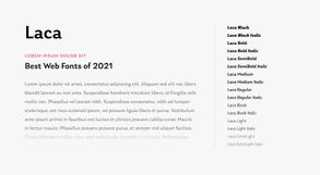
Laca
Let’s start off the list with a little bit of fun. Laca is a lively typeface that has a little personality without going overboard or becoming illegible. With a little retro inspiration, its curved nature and low contrast make it warm and approachable while keeping it versatile for digital platforms. Laca is an excellent choice if you’re looking for something friendly and charming.
Designed by Joana Correia. Published by Nova Type Foundry.
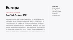
Europa
Europa has been my go-to typeface over the past few months and will continue to be one of my favorites in 2021. Based off of two classics, Futura and Gill Sans, it mixes the best of geometric and humanist styles, bringing them together into one clean, dynamic, and easy-to-read typeface. It’s a great option for both headings and body text. The only negative about Europa is its limited options for font weights – you might come across a couple of instances where a Semibold font-weight would be nice, but the benefits of Europa far outweigh this downside.
Designed by Fabian Leuenberger. Published by EuropaType.
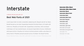
Interstate
Interstate, aptly named, was inspired by US highway signage in the 1900s. It carries familiar and official-looking, yet slightly quirky, letterforms, making it professional yet unique. Due to its wide spacing and clearly-separated letters, it’s easily legible at a distance and therefore is most popularly used for signage, but these same features make it great for website headings and larger text. I would recommend its use in display settings such as these rather than for instances of extended body text.
Designed by Tobias Frere-Jones. Published by Frere-Jones Type.
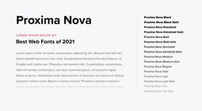
Proxima Nova
Proxima Nova was on my list back in 2019 and still continues to be one of my most-used typefaces. As a hybrid font, its versatility is incredible and can be used in a great variety of projects as it matches well with many styles and other typefaces. Its simplicity makes it highly legible, clean, and modern.
Designed by Mark Simonson. Published by Mark Simonson Studio.
Get Proxima Nova on Adobe Fonts
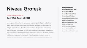
Niveau Grotesk
Niveau Grotesk brings 19th-century classical typefaces into the modern world – the unique letterforms and slight ornamentation call back to the extravagance of these classical typefaces while scaling them back and smoothing them out to create a typeface suitable for reading on modern screens and smaller reading sizes. Nivea Grotesk definitely has a style and boldness of its own but holds back enough to make it versatile for both display and body text.
Designed by Hannes von Döhren. Published by HVD Fonts.
Get Niveau Grotesk on Adobe Fonts
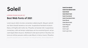
Soleil
Soleil is a fresh take on a geometric typeface, with a more fluid and flexible style than one typical finds among geometric typefaces. It combines simplicity with clarity, bringing to life text that feels energetic and easy on the eyes.
Designed by Wolfgang Homola. Published by TypeTogether.
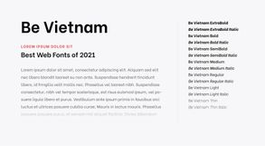
Be Vietnam
Be Vietnam is a youthful and modern typeface, mixing a modern styling of the technological age with a spirited styling that calls back to the natural feeling of hand-drawn lettering. Friendly, fun, and inviting, Be Vietnam is a font that is both unique and functional.
Designed by Gabriel Lam. Published by beGroup Vietnam.
Get Be Vietnam on Google Fonts
Serif
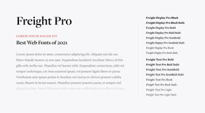
Freight Pro
Freight Pro is a superfamily of fonts, making it a great choice if you’re looking for a versatile typeface with an extensive character set. Pair Freight Display Pro for headings and larger text with Freight Text Pro for body font.
Designed by Joshua Darden. Published by GarageFonts.
Get Freight Text Pro on Adobe Fonts
Get Freight Display Pro on Adobe Fonts
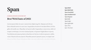
Span
Span is inspired by the engraved fonts of the 19th century but evolved for modern digital use. Sculptural and expressive, it creates a unique and elegant aesthetic.
Designed by Jamie Clarke. Published by Jamie Clarke Type.
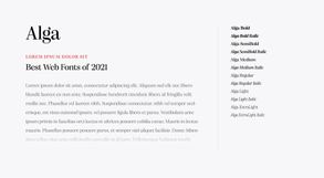
Alga
Alga is a lively high-contrast serif typeface. If you’re looking for a serif font with a lot of personality and charm, this is a great choice. Since it’s high-contrast, it’s best used in headings and large text rather than extended body copy.
Designed by Joana Correia. Published by Nova Type Foundry.
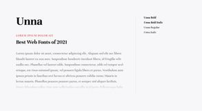
Unna
Unna is a neoclassical typeface, meaning it has a more solid presence. It combines soft serifs with strong stems to create a feeling of elegance and friendliness. Unfortunately, there are only 4 font weights available on Google Fonts for free, but if you’re looking for more versatility, there are Light and Medium weights available for purchase elsewhere.
Designed by Jorge de Buen. Published by Omnibus-Type.
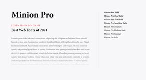
Minion Pro
Minion Pro is a staple if you’re looking for a simple serif typeface. Classic and clean, it’s easy to read and straightforward, so it won’t distract from the content. Designed for body text and extended reading, plus its large library of font weights and characters, makes it versatile and usable for any occasion.
Designed by Robert Slimbach. Published by Adobe Originals.
Get Source Serif Pro on Adobe Fonts
Get Source Serif Pro on Google Fonts

