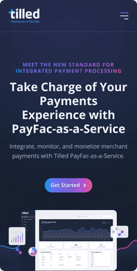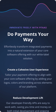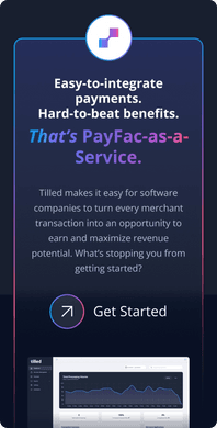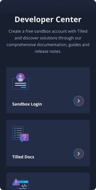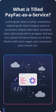

Tilled is a leading PayFac platform for embedded payment processing. They came to in need of a complete website overhaul that matched the edgy, innovative, push-the-envelope personality of their company. We worked with them to imagine and create a design system based off their current brand guidelines to breathe fresh life into their web presence.
Meet the Client
Tilled is a leading PayFac platform for embedded payment processing. They combine easy-to-integrate payment technology, full-service offerings, and transparent pricing to deliver software companies a simple way to harness the full power of payment facilitation–minus the upfront cost, overhead, and liability.
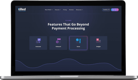


Bringing a fresh approach.
Our challenge with Tilled’s new website and design system was to take their current branding and give it new life, bringing a fresh approach that encompassed the magnetic personality of their company. We also were tasked with building out a design system that would help them expand and streamline their visual identity as they moved forward into the future.
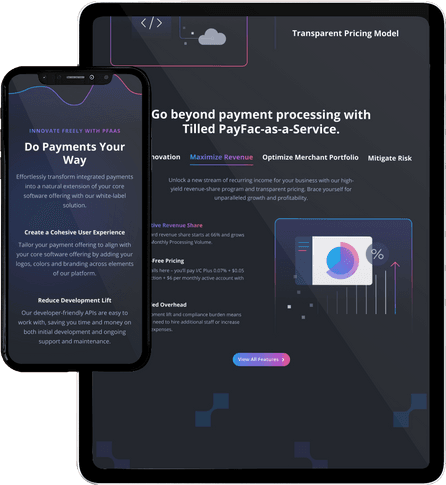
The renovation of a brand.
Alongside Tilled’s team, we worked to creatively renovate their brand and build a design system that would prove to benefit them as they moved into the future. Our goal was to create something that looked unique to Tilled while still improving the ease of use for their customers and potential customers visiting their site.
Telling the right story.
Tilled’s new design system and website fulfill what they needed to move their brand forward. It showcases their edgy, approachable personality while building consistency across their brand to streamline scaling and replication, all making for a more cohesive user experience. The visual consistency alongside our UX expertise builds the story that Tilled wants to tell across their brand and site—ultimately, who they are and why they can be trusted.
A cohesive brand library
Tilled’s new design system provides them with a cohesive library of brand elements that keep their visual identity consistent across all aspects of their brand.
User-focused objective
In order to benefit Tilled most, we kept our eyes on the end goal—the user. Our UX/UI choices were all centered around best practices for what Tilled’s audience needed most.
Interactive components
To build toward our goal of a really engaging, tech-forward feeling, we built in custom interactive components throughout the site.
